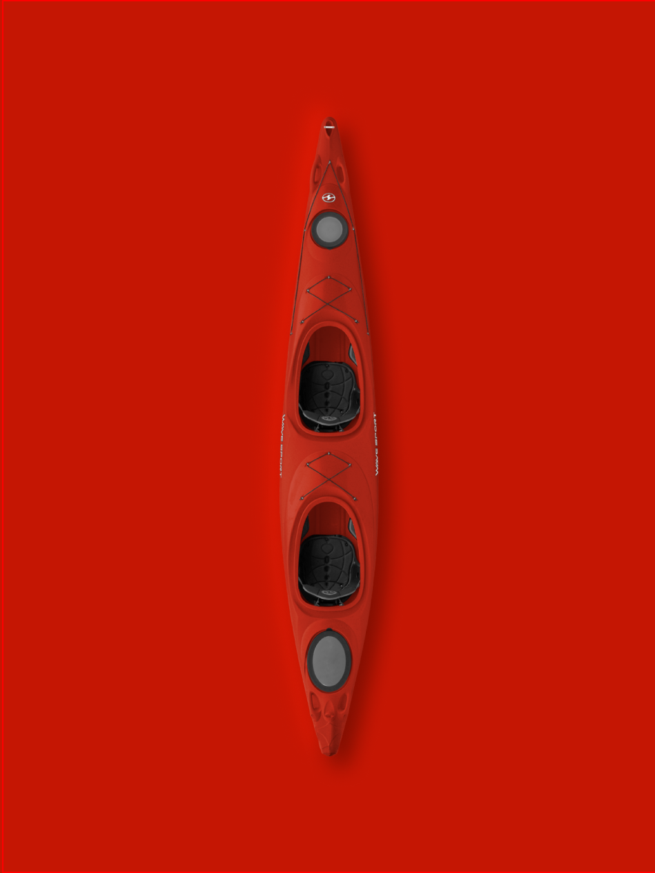
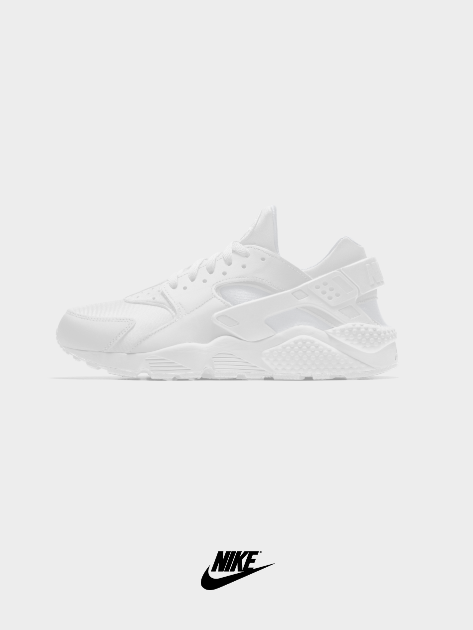
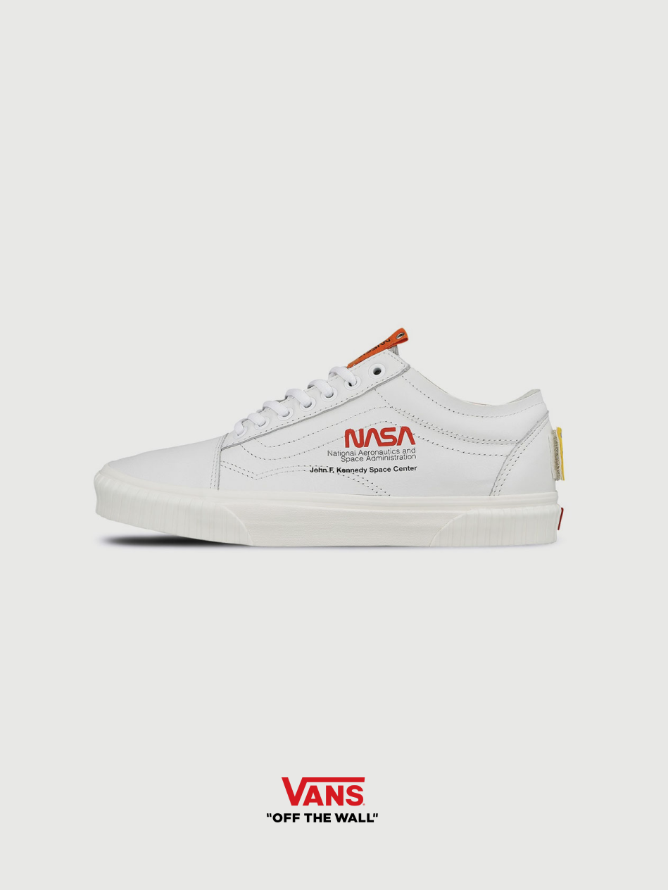
Nike court
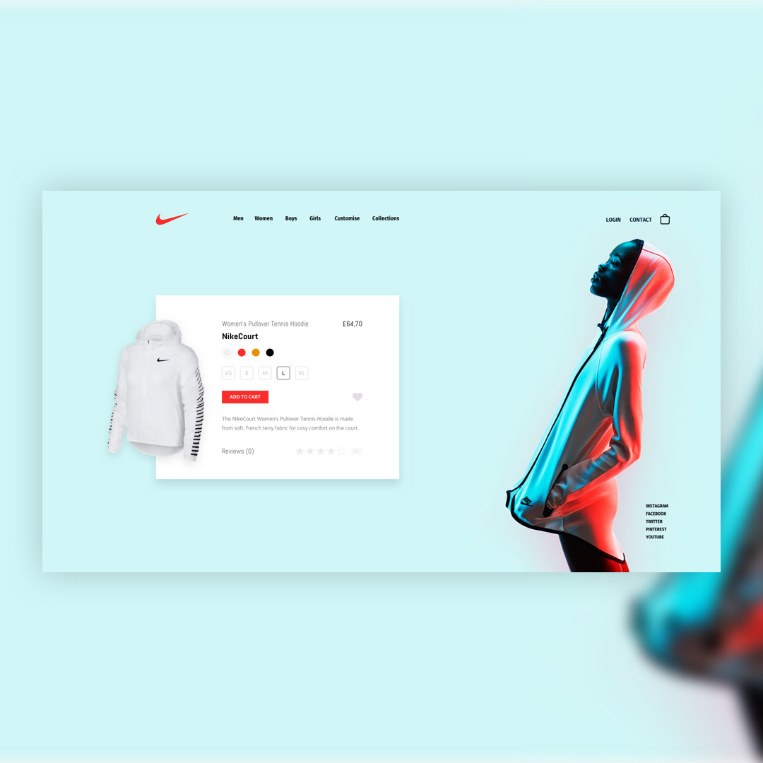
Product Card Concept.
A card product concept focused on what really matters to you.
Nike is an American multinational corporation that is engaged in the design, development, manufacturing, and worldwide marketing and sales of footwear, apparel, equipment, accessories, and services.
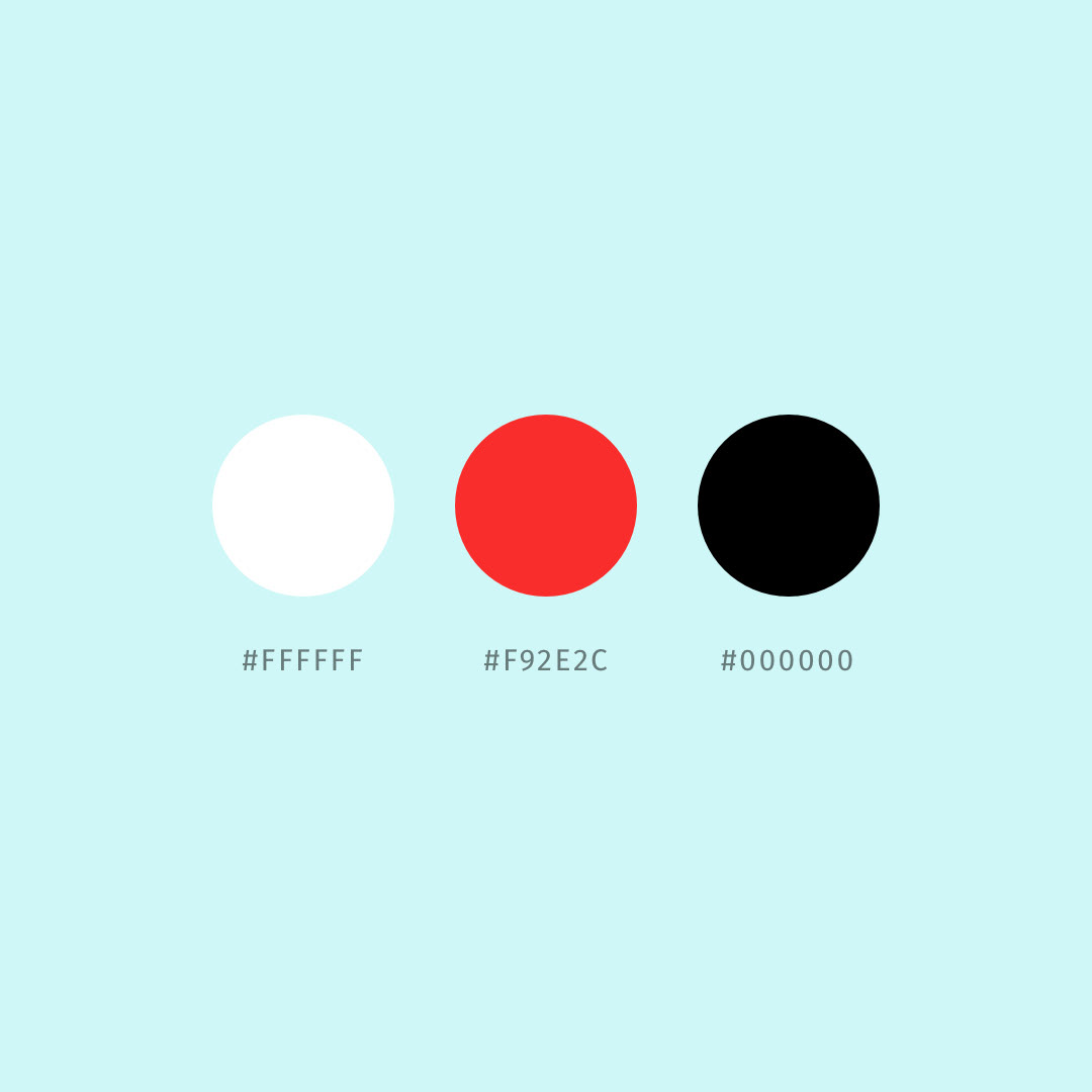
This is part of a series of personal projects that explore quick ideation. Each piece of this series has been done in less than four hours and delivers one visual using 3 main colours. With this practice I don't pretend to deliver a final visual, the main goal is to explore my creative taste and train myself to think and paint my thoughts quickly.
Project Goals
Summarise in a comprehensive way all the elements that a product card should show.


Conclusions
Using colours to help users to identify next steps is key. Therefore in this design, we can see how the red colour for the "Add to cart" button doesn't really help in this design.
Learn more about the project.
